10 Website Design Ideas To Inspire Your Vision
For a small business owner embarking on the journey of designing a new website–or maybe redesign of your current site–the internet can seem like a large scale version of The Bachelor. Each user is a bachelor standing in front of a giant crowd of single sites that are trying to win their affection. How do you stand out from the crowd to catch that user’s eye?
High-quality website design is key. You need to grab a user’s attention to get a “first date” and build a relationship so they want to keep coming back.
Social media pages certainly have their place in any good digital marketing strategy, but many times potential customers want more in-depth content, and your website gives you a custom platform to showcase your personality.
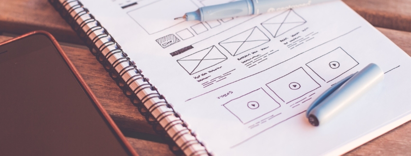
The website layout, color palette, typography and other design elements must all converge to create an engaging user experience.
Of course, that’s easier said than done. How do you know what will attract the visitors you’re looking for? Where do you even start?
If you’re struggling to come up with ideas, it’s time to look for some web design inspiration. You should steer clear of simply copying someone else’s webpage design, but studying web design examples can help you glean some design tips, and appealing sites can get your creative juices flowing. Here are some of our favorites.
Examples of Great Website Design Ideas
Your site should be a unique reflection of your brand and your specialty. Still, checking out successful sites can give you ideas for how to incorporate a design that fits your brand. Check out these sources of website design inspiration:
1. Woven Magazine
Woven Magazine is all about telling the stories of artists and entrepreneurs. They focus on offering inspiration to dreamers with a natural, eco-friendly vibe.
Their website is so effective because it exudes this same personality. It has a simplistic, airy, natural look that makes exceptional use of white space to keep things clean and crisp. With one glance, you know the atmosphere they want to cultivate. When it comes to branding your company, your website is one of the top ways to reinforce brand identity, and Woven’s site does it well.
2. FEED Projects
We included several different types of sites on this list. Some are informational, like Woven Magazine, some are portfolio websites, and others–like FEED Projects–are e-commerce websites. If you want a clean, modern design, e-commerce sites can present quite a challenge.
As you make sure to include all the product listings and functionality you need, it’s easy for your site to get cluttered and for website design to take a backseat. Not only is clutter unattractive and distracting, but it can lead to slow loading times that chase away impatient customers.
FEED Projects manages to present an e-commerce website with an ultra-clean, modern look. They focus on simple, yet impactful images, and the text is kept to a minimum – leaving room for important information and CTAs. The navigation is also intuitive and easy to use.
3. NOWNESS
For a site focused on art, website design is crucial. You want the site itself to be an attraction without distracting users from the other artists’ work. That’s the balance NOWNESS has artfully struck.
This site takes “simple” to its pinnacle. NOWNESS is focused on the art of filmmaking, creating and spreading artistic videos. You don’t need us to tell you this, though. The videos are front and center on the site, drawing in the viewer so there’s no question where your focus should be.
4. Mikiya Kobayashi
One of the most important concepts of web design is that your business’ purpose should be clear from the get-go. There may not be any site that does this better than Mikiya Kobayashi‘s website.
As soon as you land on the homepage, you’re greeted by a giant picture of one of the artist’s products. As you begin scrolling, you’re presented with a grid of images where you can see other projects. There’s no guesswork and no clutter.
Kobayashi’s site design works as a great example of the way small design elements can affect a site’s feel. When you hover over an item in the navigation you see a line through the copy. It seems inconsequential at first, but it makes you take notice because it’s an unconventional feature. Details like these can add to your site’s unique feel.
5. Game Changers
When people consider homepage design, they tend to think in terms of squares or tiles. Game Changers wanted to break the mold and go way outside the box. Sometimes bucking the convention of standard web design trends is the best way to get noticed.
There’s nothing subtle or minimalist about the theme on Game Changers site. Visitors are immediately smacked in the mouth with intense, fast-paced video in the hero image on the homepage. It may not be the best website design for everyone, but for a sports-centric company that wants to motivate and convey excitement, it hits the mark.
6. Tej Chauhan
Tej Chauhan is a designer who creates useful products with a futuristic look. His site uses a unique feature: it plays through a quick slideshow of products before landing on the static homepage.
This combines a few hallmarks of a great website design. It effectively communicates the site’s purpose right away while engaging visitors with a dynamic slideshow. Along with that attention-grabber, the site also incorporates the designer’s modern style into the design. The designer’s branding is also central to the layout.
7. Gary Sheng
You don’t need a Fortune 500 budget and an overpriced graphic design company to have a high-quality website design. Sometimes personal resume sites can offer inspiration of their own, and that’s the case for Gary Sheng’s site.
This website opens with exactly what you’d get when you meet someone–a face and a name. From the start, it’s clear who you’re reading about.
We also love another feature of this site you may not even realize: the navigation is minimal. It’s basically one scrollable page, but it includes all the information you need.
Some companies think they need a complex structure of pages for their site to look professional. However, this site is proof that sometimes less really is more, and it’s a great source for website design inspiration.
8. APPS
There’s no universal formula for a great website design. Many of the sites above are great because they’re simple and easy to use. But, what if you think a little more adventurous approach would make the best web design for your business?
APPS is a hard cider brand, but their site is more than a catalog of products. Instead, it’s an interactive tour of the cider-making process. Using guided interaction, a user can step into the production process and take a closer look at how their cider is made.
This serves multiple purposes. First, the interaction draws a user’s attention and increases engagement. Visitors are compelled to stay on the site because they want to find out what happens next. Second, it makes the user feel invested in the brand. The next time you shop for hard cider, you’ll feel more connected to APPS because you’ve had a glimpse into the process.
9. The Everywhereist
The Everywhereist is a personal blogging site that embraces an edgy and clever voice. However, it’s also a great example of using basic graphic design elements in your website design.
This site’s navigation is fairly simple–four options portrayed in the header with sketch-like icons. As you scroll through the site, you’ll recognize that same graphic style throughout. This builds a consistent and distinguishable brand identity.
The design elements of The Everywhereist also bring something else to the table. They express the idea that this is a woman’s journal. It’s a creative space where she shares her thoughts and adventures with the world. Matching your website design style to your product is a strong way to reinforce branding and show users what you’re all about from the start.
Not only is the site clean and consistent with its product, it also utilizes responsive design that works really well. Notice how the site looks different when viewing from a mobile device versus a desktop – the experience caters to where the user is at. It’s important to have your experience cater to the user’s device to keep them engaged, which can also help your site’s SEO with search engines.
10. Case 3D
Case 3D, an architectural design firm, has a relatively simplistic website design. However, the dynamic imagery immediately captures the visitor’s attention. On the projects page, breathtaking photography and stunning scenery take center stage.
Another critical design element on Case 3D’s site is the loading animation. Visitors expect fast loading times and can get impatient if a site doesn’t load quickly. Due to the image-rich content, Case 3D doesn’t have the fastest loading times, but they have interesting animation to watch as you wait.
This loading animation serves a couple purposes. First, it keeps users from getting bored and bouncing from the site. Second, it signals to visitors that their content will be displayed momentarily. No one wants to sit on a site for minutes only to realize that it isn’t working. A loading animation reassures users that this won’t be the case.
Designing a Website of Your Own
Looking for website design inspiration has its pros and cons. It’s a great way to find website design ideas you can tailor to fit your own brand, including color schemes, typography and more. Plus, it helps you assess your competition.
For some small businesses, though, it can leave them feeling overwhelmed and wondering if they could ever produce a design as appealing as the ones they’ve seen.
That’s why so many of these businesses hire a professional web designer. If you want a beautiful site that enhances user experience and effective landing pages that convert, skip the DIY website builder template and consult with a web design team who can make your creative vision a reality. If you’re ready to get started, contact our web development and design team.

