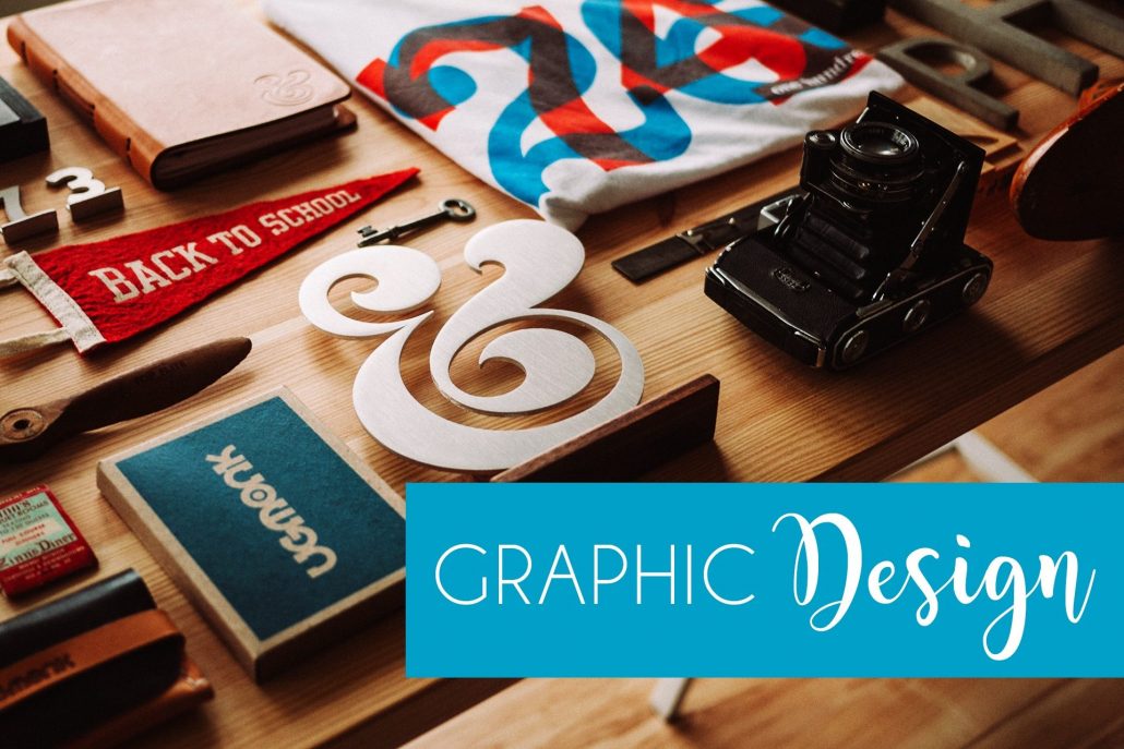
2017 Graphic Design Trends | What to Look For…
Everything old is new again. But, everything that’s new is pretty darn great! There are several new trends in graphic design that are sure to delight designers seeking ways to create fun, ingenious visuals for consumers.
Here are the seven newest design trends to keep an eye on:
MODERN-RETRO
Retro styling in advertising can be fun! The use of modern-retro design began to rise in popularity throughout 2016, and the high demand for such designs is likely to continue, thanks to modern-retro being a fun fusion of the old and new.
By using modern typefaces and color palettes, along with retro-style logos, designers are able to create eye-catching, nostalgia-inducing designs that fascinate and engage consumers.
RESPONSIVE LOGOS
In the expanding world of technology, we consume our information in a variety of different formats. Whether scrolling through a smartphone, tablet, laptop, or (even when kickin it old school) on the PC, logos need to respond to each and every platform.
Responsive logos adapt, based upon the environment in which they are displayed – i.e. they are smaller on phones than on laptops. They must be simple and amenable to every device, and the importance of this versatility will only continue to increase throughout 2017.
CINEMAGRAPHS
Website viewers want an interactive experience, and cinemagraphs provide that type of experience in a simple fashion. If you aren’t already aware, cinemagraphs are still pictures that include a minor, repeated movement, and they are becoming increasingly popular.
Cinemagraphs are typically published as GIFs, and they provide a simple, effective way to captivate the viewer (since moving images work faster to grab attention). As competition for that attention increases, expect to see more of these cinemagraphs in 2017.
MINIMALISM
The premise of minimalism is a focus on simplicity and functionality. This particular form of design has been around since the early part of the 20th century, and is still popular today – Apple is a great example.
Creating deliberate whitespace, which allows for easier reading and more prominent focal points, is essential (thanks to the drastic decrease in viewers’ attention spans). Simplicity is here to stay… at least for 2017.
ILLUSTRATED (HAND DRAWN) IMAGES
Illustrations provide a human element to graphic design, and can be used as a simple way to translate complex situations. And, if we’re being honest, they’re just plain fun!
Some illustrations can be simple with a childlike feel that evoke nostalgic memories, while others can be quite intricate. But, either way, illustrations are becoming increasingly popular with consumers, and the individualism of these illustrations will only continue to grow within the next year.
MODULAR LAYOUTS
The concept of breaking up long blocks of text into manageable chunks is increasingly important, and graphic designers are quickly seeing the benefits of making website content easily consumable.
Modular, clean layouts create a better viewer experience, and encourage interaction. They also look extremely professional (when done well).
BOLD PHOTOGRAPHY AND SLEEK TEXT
Bold photography and sleek text is a staple in the graphic design world, because it captivates viewers and exudes style. This mixture of bold and sleek is essentially the little black dress of design, and will likely never go out of style.
Great pictures and appropriate text quickly grab attention, which is increasingly difficult to do. Time magazine recently cited a study from Microsoft that notes human attention spans to be (literally) worse than that of a goldfish, thanks to our digital lifestyle. Check out the Time article here: http://time.com/3858309/attention-spans-goldfish/.


